
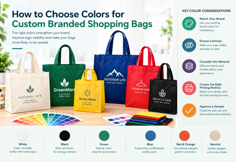

Color is one of the first things customers notice when they see a shopping bag. Before they read a logo or recognize a company name, the combination of colors can already shape their impression of the brand.
For retailers, supermarkets, fashion boutiques, promotional agencies, and other businesses ordering custom shopping bags, choosing the right color is more than a design decision. It affects brand recognition, logo visibility, product presentation, and the consistency of packaging across different sales channels.
However, the most attractive color combination on a computer screen may not produce the same result on a finished bag. Fabric color, printing methods, surface texture, and production conditions can all influence the final appearance.
This guide explains how to choose colors for custom branded shopping bags, how to balance brand identity with practical requirements, and what B2B buyers should confirm before placing a bulk order.
1. Why Color Matters for Custom Branded Shopping Bags
A well-designed shopping bag can do more than carry products. It can reinforce brand identity, improve the shopping experience, and keep a business visible after the customer leaves the store.
Build consistent brand recognition
Using consistent colors across shopping bags, product packaging, storefronts, websites, and promotional materials helps create a recognizable visual identity.
For example, a retailer that consistently uses dark green, cream, and a simple logo can create a coordinated look across its packaging. Customers encounter the same visual cues in different places, making the brand easier to recognize.
When ordering custom bags, start with your existing brand guidelines instead of selecting a completely new palette for each packaging project.
Improve logo visibility
A logo needs enough contrast against the bag to remain clear at the actual printed size.
A dark navy logo may stand out on a white bag, while a white logo may be more effective on a dark green or black background. By contrast, a pale logo on a light-colored bag may become difficult to see.
The best color combination is not necessarily the most colorful one. It is the one that communicates your brand clearly.
Strengthen product presentation
Bag colors can support the positioning of a business. A fashion boutique may prefer restrained colors and a clean design, while a children’s retailer might use brighter combinations.
The goal is to select colors that complement the products, the target audience, and the overall shopping experience.
Support long-term marketing
Reusable shopping bags may continue to be used after the original purchase. A clear logo and recognizable color scheme can help keep a brand visible in everyday settings.
For this reason, businesses should consider whether a bag design will remain suitable for regular use, rather than choosing a color combination that works only for a short promotional campaign.
2. Start With Your Brand Identity
Before choosing the color of the bag itself, identify the colors your business already uses.
Review your logo, website, product labels, storefront signage, and existing packaging. Determine which colors are essential to your identity and which are optional.
A practical brand palette usually includes:
- Primary color: The main color associated with your brand.
- Secondary color: A supporting color that complements the primary shade.
- Neutral color: White, black, cream, gray, or another understated shade.
- Accent color: An additional color used selectively for emphasis.
You do not need to use every brand color on every bag. In many cases, a neutral bag with a well-positioned logo creates a cleaner and more effective result than a design containing too many competing colors.
If your company already has established brand guidelines, share them with your packaging supplier before production begins.
3. How Different Bag Colors Influence Design Choices
There is no single best color for every business. The right option depends on your brand identity, logo artwork, product category, and intended application.
White shopping bags
White provides a clean, neutral background for many logo styles.
Advantages:
- Works with many brand color combinations
- Makes dark logos easy to distinguish
- Supports minimalist and modern designs
- Suitable for retail, cosmetics, gifts, and promotional packaging
Considerations:
White surfaces can show dirt and handling marks more readily than darker colors. If the bags will be used frequently, consider how they will look after normal handling and storage.
White can be an effective option for businesses that want their printed logo to remain the main visual feature.
Black shopping bags
Black can create a bold, restrained appearance that works well for selected fashion, beauty, electronics, and premium retail applications.
Advantages:
- Provides strong contrast for white or suitable metallic-looking artwork
- Supports minimalist brand designs
- Can create a coordinated appearance with dark packaging
Considerations:
Dark backgrounds require careful logo selection. Dark navy, deep gray, and black artwork may blend into the bag surface. Fine details and small text should be reviewed carefully, and the chosen printing process must be suitable for the material and artwork.
Black bags are worth considering when your brand identity calls for a strong, understated presentation.
Green shopping bags
Green is often used by brands that want to express an association with nature, gardening, outdoor products, or environmentally focused initiatives.
Advantages:
- Can support nature-inspired visual identities
- Offers a range of shades, from soft sage to deep forest green
- Pairs well with suitable white, cream, or contrasting logos
Considerations:
Choose the shade carefully. A bright green bag may suit a lively promotional campaign, while a darker shade may work better for a restrained retail design.
If your business makes environmental claims, ensure those claims are supported by the product’s actual material and relevant evidence. A green color alone does not establish that a bag is environmentally friendly.
Blue shopping bags
Blue is versatile and can suit businesses across retail, electronics, professional services, and promotional merchandise.
Advantages:
- Available in a broad range of shades
- Can support both understated and energetic designs
- Works with white and other suitably contrasting artwork
Considerations:
Consider how the shade interacts with your logo. A dark blue bag may work well with white printing, while a brighter blue may require a different treatment to maintain clear contrast.
If blue is already a core brand color, matching the bag to your established identity can help maintain consistency.
Red and orange shopping bags
Red and orange can create a strong visual presence and may suit seasonal campaigns, food retail, event merchandise, or brands with energetic identities.
Advantages:
- Can make a bag visually prominent
- Suitable for bold promotional graphics
- Offers opportunities for distinctive seasonal designs
Considerations:
Bright backgrounds can compete with detailed logos or small text. Keep the artwork simple, check color contrast, and avoid combinations in which adjacent colors become difficult to distinguish.
These colors are especially useful when the packaging needs to attract attention, but they should still fit the brand rather than simply follow a trend.
Natural and neutral colors
Cream, beige, gray, and other muted shades can support a restrained, understated look.
These colors may suit boutiques, lifestyle brands, gift shops, and businesses that prefer a subtle packaging design.
However, neutral colors can also reduce logo visibility if the artwork uses a similar shade. Always test the actual logo against the proposed background before confirming the design.
4. Choose Bag Colors Based on Your Business Type
A useful color decision begins with the customer and the purpose of the bag.
| Business type | Color direction to consider | Design priority |
|---|---|---|
| Fashion boutiques | Black, cream, white, or brand colors | Consistent brand presentation |
| Supermarkets | Strong brand colors or practical neutrals | Recognition and everyday usability |
| Cosmetics and beauty | White, black, soft neutrals, or signature colors | Clean, coordinated appearance |
| Gift shops | Seasonal shades or coordinated brand colors | Gift presentation |
| Trade shows and events | High-contrast brand colors | Easy identification and visibility |
| Corporate promotions | Established company colors | Consistency across marketing materials |
| Garden and outdoor retailers | Green, earth tones, or brand colors | Fit with product and brand identity |
These are starting points rather than fixed rules. A fashion brand can use bright orange, and a supermarket can use minimalist black. What matters most is whether the colors support the business’s identity and work effectively on the finished bag.
5. Make Sure Your Logo Stands Out Against the Bag Color
Choosing a bag color and choosing a logo color should be treated as one design decision.
A bag may look attractive by itself, but the final combination can fail if the logo is difficult to read.
Use contrast deliberately
Consider these combinations as starting points for testing:
- White bag with a black or dark navy logo
- Black bag with a white logo
- Dark green bag with white or cream artwork
- Natural-colored bag with a dark green or black logo
- Blue bag with white artwork, if the selected shades provide sufficient contrast
These combinations are not guaranteed to work for every logo. The size of the artwork, printing process, material surface, and exact shades can all affect readability.
Keep small details readable
Complex logos often contain thin lines, small lettering, or several closely spaced colors.
Before printing, review the artwork at the actual size it will appear on the bag. If necessary, prepare a simplified version for packaging applications.
A clear, recognizable logo is generally more useful than a highly detailed design that becomes difficult to reproduce at a small size.
Consider the logo’s placement
Color contrast matters, but placement also affects visibility.
For example, a centered logo on the front panel may be more noticeable than a small logo near the bottom corner. The best placement depends on the bag dimensions, handle position, and intended display orientation.
Ask your supplier to show the artwork on a realistic bag mockup so you can review the complete composition.
6. Understand How Non-Woven Fabric Affects Color
For businesses ordering custom non-woven shopping bags, the fabric itself is an important part of the color decision.
PP non-woven bags are available in different constructions and finishes. Depending on the product specification and manufacturing process, the material surface can affect how the final colors appear.
Standard non-woven fabric
Standard non-woven fabric provides a textured surface that may be suitable for many everyday shopping and promotional bags.
When choosing a fabric color, consider how the surface texture may affect the appearance of fine artwork, small text, and large areas of solid printing.
Laminated non-woven bags
Laminated non-woven bags have an added surface layer that can provide a different visual finish from standard non-woven material.
Depending on the construction, a matte or glossy finish may influence how colors appear under different lighting conditions.
For example, a glossy surface may reflect more light, while a matte surface can provide a more subdued appearance. Neither is automatically better. The right finish depends on the intended design and brand positioning.
Custom-colored bags
If you want the bag body to closely match a specific brand color, ask the supplier what color options are available for your required bag construction and order quantity.
Exact matching may be affected by available materials, production methods, and manufacturing tolerances. A digital mockup is useful for reviewing the design, but it should not be treated as a guarantee of the final physical color.
7. Choose the Right Printing Method for Your Color Design
Your color palette should be compatible with the printing method used for the bag.
Different methods have different strengths, and suitability depends on the material, artwork, order quantity, and required finish.
Screen printing
Screen printing can be suitable for many bold logos and designs using a limited number of colors.
It is worth considering when the artwork contains clear shapes, solid colors, and relatively simple graphics.
Ask your supplier to confirm which colors can be reproduced effectively on the selected fabric and whether the artwork needs adjustment.
Heat transfer printing
Heat transfer can be suitable for certain designs requiring more detailed graphics or specific visual effects, depending on the material and production process.
The supplier should confirm whether the chosen transfer method is compatible with the bag material and whether the finished print meets your expectations for appearance and durability.
Printing on laminated material
Some laminated bag constructions support printing approaches that differ from those used on standard non-woven fabric.
If your design includes several colors, gradients, or more detailed graphics, discuss the available printing options with the manufacturer before finalizing the artwork.
The key is not to select a printing method based on color count alone. Material compatibility, design complexity, production quantity, and the desired finished appearance should all be considered together.
8. How to Keep Colors Consistent Across Bulk Orders
For B2B buyers, color consistency becomes particularly important when ordering large quantities or repeating orders over time.
A bag color that differs noticeably from a previous shipment can create problems for retailers, especially when the packaging is used across multiple stores or coordinated with other branded materials.
To reduce the risk of unwanted variation, establish a clear approval process.
Provide accurate brand references
Share your logo files, brand color references, and any relevant packaging guidelines.
Digital color values can help communicate the intended design, but they do not automatically translate into an identical result across different materials and printing processes.
Approve a physical sample when appropriate
A physical sample allows your team to inspect the bag material, printed colors, logo placement, handles, and overall finish.
Review the sample under ordinary lighting conditions rather than relying only on a monitor or a photograph.
Record the approved specifications
Keep a record of the approved bag color, printing method, artwork version, material, and finish.
For repeat orders, these specifications give both your business and the supplier a clear reference point.
Confirm changes before production
If you change the fabric, printing process, logo color, or finish, request a new review when the change could affect the finished appearance.
A controlled approval process is particularly useful for businesses ordering bags for multiple stores, seasonal campaigns, or ongoing retail operations.
9. Common Color Selection Mistakes to Avoid
Even a well-established brand can encounter avoidable packaging problems when color decisions are made too quickly.
Choosing a color only because it is trendy. A popular shade may not fit your brand or remain suitable for future campaigns.
Ignoring logo contrast. Attractive colors are of little use if the logo becomes difficult to recognize.
Assuming screen colors will match printed colors exactly. Screens emit light, while printed surfaces reflect it. The two can look different.
Using too many colors. Too many competing elements can weaken visual hierarchy and make the bag look cluttered.
Overlooking the fabric finish. A textured or laminated surface may affect the appearance of the artwork.
Approving a design without reviewing a sample. A mockup cannot fully show the feel, surface, and physical appearance of a finished bag.
Changing colors between repeat orders without documenting the change. This can make packaging less consistent across stores or campaigns.
Avoiding these mistakes helps businesses move from an attractive concept to a more predictable production result.
10. A Practical Checklist Before Ordering Custom Branded Shopping Bags
Before approving your next order, use this checklist to align the design with your brand and production requirements.
-
Confirm the primary and secondary brand colors.
-
Select a bag background that supports the logo.
-
Check logo readability at the actual printed size.
-
Confirm the non-woven material and surface finish.
-
Discuss suitable printing methods with the supplier.
-
Confirm which colors and finishes are available.
-
Review the bag design, logo placement, and overall proportions.
-
Request a physical sample when appropriate.
-
Check the approved sample under normal lighting.
-
Document the final color and production specifications.
-
Confirm the order quantity, pricing, and production schedule.
For a quotation, provide the supplier with your target quantity, bag dimensions, intended application, preferred material, logo artwork, and color references. The more complete the specifications, the easier it is to evaluate suitable options.
11. Work With a Manufacturer to Develop Your Custom Shopping Bags
Choosing the right colors is only one part of developing effective branded shopping bags. The material, bag dimensions, handle construction, printing method, and production requirements all contribute to the final result.
For businesses planning wholesale orders, working with a manufacturer that can discuss these elements together can make the specification and approval process more straightforward.
At CXGIAE, businesses can explore customized non-woven bag options for retail packaging, promotional campaigns, and brand projects. Discuss your preferred colors, logo requirements, bag style, and order quantity to identify a suitable configuration.
Explore our Custom Non-Woven Bags for Business Branding and Wholesale Supply to learn more about available customization options and prepare your next packaging project.
Conclusion
The best colors for custom branded shopping bags are the ones that make your brand recognizable, keep your logo clear, and suit the bag’s intended use.
Start with your existing brand identity, choose a background that supports the artwork, consider the material and printing method, and confirm the finished appearance before bulk production.
For B2B buyers, a well-planned color specification helps create packaging that looks consistent, represents the business professionally, and supports long-term brand recognition.